SimiC Pipeline - Visualization Tutorial

Author: Irene Marín-Goñi, PhD student - ML4BM group (CIMA University of Navarra)

This notebook provides a comprehensive guide to explore SimiCPipeline results and generate visualizations with publication-quality.

Overview

This tutorial covers: 1. Creating a visualization object from your results 2. Customizing labels for better readability 3. Weight distribution visualizations 4. AUC score distributions and comparisons 5. Dissimilarity heatmaps 6. UMAP integration with TF activity scores 7. Network-specific visualizations

For preprocessing steps, see Tutorial_SimiCPipeline_preprocessing.ipynb.

For pipeline execution, see Tutorial_SimiCPipeline_full.ipynb

Setup

The easiest way to configure your environment is to follow the README instructions using poetry (or Docker).

Required packages for this tutorial: - simicpipeline - pandas - numpy - os - pickle - anndata (for UMAP visualizations) - scanpy (for UMAP visualizations)

import os
print(os.getcwd())
print(os.listdir())
import simicpipeline 
print(f"SimiC pipeline version: ", {simicpipeline.__version__})
from simicpipeline import SimiCVisualization
/home/workdir
['SimiCExampleRun', 'data']
SimiC pipeline version:  {'0.1.0'}

Step 1: Initialize Visualization Object

Create a visualization instance loading data from your completed pipeline run. - project_dir: Working directory path where input files are located and output files will be saved - run_name: Unique identifier for this analysis run (used as prefix for output files) - search: Bool for whether to automatically search for simic output files in project directory. Default: True. - lambda1: Lambda1 regularization parameter (optional) - lambda2: Lambda2 regularization parameter (optional) - label_names: Dictionary mapping labels to custom names (optional) - adata: AnnData object containing cell metadata (optional)

viz = SimiCVisualization(
    project_dir="./SimiCExampleRun/KPB25L/Tumor",
    run_name="experiment_tumor",
    lambda1=1e-2,
    lambda2=1e-3,
    p2assignment="./SimiCExampleRun/KPB25L/Tumor/inputFiles/treatment_annotation.csv",
    label_names={0: 'Control', 1: 'PD-L1',2: 'DAC',3: 'Combination'},
    colors={0: '#e0e0e0', 1: '#a8c8ff', 2: '#ffb6b6', 3: '#c1a9e0'}
)
Warning: Figures path already exists. Existing figures may be overwritten.
# Initialize visualization object
viz = SimiCVisualization(
    project_dir="./SimiCExampleRun/KPB25L/Tumor",
    run_name="experiment_tumor",
    lambda1=1e-2,
    lambda2=1e-3,
    p2assignment="./SimiCExampleRun/KPB25L/Tumor/inputFiles/treatment_annotation.csv",
    label_names={0: 'Control', 1: 'PD-L1',2: 'DAC',3: 'Combination'},
    colors={0: '#e0e0e0', 1: '#a8c8ff', 2: '#ffb6b6', 3: '#c1a9e0'}
)

print(f"✓ Visualization object created")
print(f"  Project directory: {viz.project_dir}")
print(f"  Run name: {viz.run_name}")
print(f"  Figures will be saved to: {viz.figures_path}")
# List available results (check in case there were typing errors)
viz.available_results()
viz.print_project_info(max_depth=4)
Creating figures directory at: SimiCExampleRun/KPB25L/Tumor/outputSimic/figures/experiment_tumor
✓ Visualization object created
  Project directory: SimiCExampleRun/KPB25L/Tumor
  Run name: experiment_tumor
  Figures will be saved to: SimiCExampleRun/KPB25L/Tumor/outputSimic/figures/experiment_tumor

Available Results:
✓ Ws_raw
✓ Ws_filtered
✗ auc_raw
✓ auc_filtered

======================================================================
Tumor/
├── inputFiles/
│   ├── TF_list.csv
│   ├── expression_matrix.pickle
│   └── treatment_annotation.csv
└── outputSimic/
    ├── figures/
    │   └── experiment_tumor/
    └── matrices/
        └── experiment_tumor/
            ├── experiment_tumor_L1_0.01_L2_0.001_simic_matrices.pickle
            ├── experiment_tumor_L1_0.01_L2_0.001_simic_matrices_filtered_BIC.pickle
            ├── experiment_tumor_L1_0.01_L2_0.001_wAUC_matrices_filtered_BIC.pickle
            └── experiment_tumor_L1_0.01_L2_0.001_wAUC_matrices_filtered_BIC_collected.csv

Just that simple the viz object localized all the data and you can start plotting!

Step 2: Weight Distribution Visualizations

R² Distribution Plots

Visualize the quality of regression fits across phenotypes.

# Plot R² distributions
fig = viz.plot_r2_distribution(
    threshold=0.7,
    # labels =[0,2],
    save=True,
    grid_layout=(2,2),
    filename="R2_distribution.pdf"
)
print("✓ R² distribution plots created")

======================================================================
PLOTTING R² DISTRIBUTIONS
======================================================================

✓ R² distribution plots created

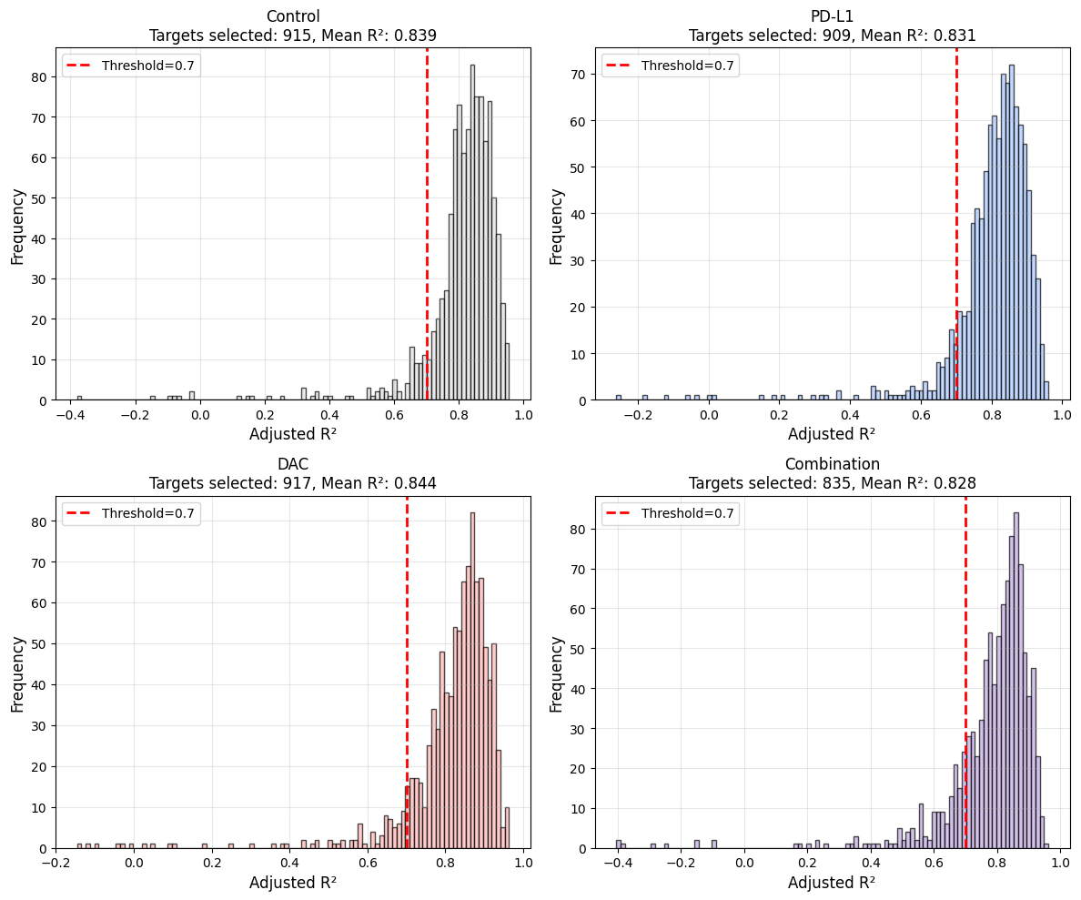
Here we can see that the distribution of adjusted R2 values across all targets. Most of them are over 0.7, indicating that the model explains a significant portion of the variance in the target gene expression. However, there are also some targets with low or negative adjusted R2 values, suggesting that the model does not fit well for those targets. This could be due to various reasons such as noise in the data, missing regulatory interactions, or complex regulatory mechanisms that are not captured by the model.

For these targets with low adjusted R2, we suggest to filter them out before plotting. For the TF-barplots we already allow this with the parameter r2_threshold. We selected a threshold of 0.7 as it was the same used to calculate the activity scores during the SimiC pipeline (See Tutorial_SimicPipeline_full.ipynb -> auc_params = { 'adj_r2_threshold': 0.7,...})

You can change this threshold as needed, but you should re-run the SimiCPipeline auc calculation with the same threshold to be consistent.

With this function you can extract the targets that do not pass the threshold

# This is an example on how to extract the list of targets that were filtered out based on the R² thresholding
unselected_targets = viz.get_unselected_targets('Ws_filtered', r2_threshold = 0.7)
print(unselected_targets[0][0:5])
print(len(unselected_targets[0]))
['Malat1', 'Rn18s-rs5', 'Cmss1', 'Lars2', 'Frmd5']
85

As described in Tutorial_SimicPipeline_full.ipynb you can extract the network for a specific TF with the r2_threshold desired. NaNs will be displayed if the target gene has an adjusted R2 value below that threshold.

# Example of specific TF network extraction
df = viz.get_TF_network( TF_name="Zfp950", stacked = True, r2_threshold=0.7)
print(df.head(10))
print("\n","*"*70,"\n")
print("TF network shape:")
print(df.shape)
Retrieving network for TF: Zfp950
Filtered out 696 targets. 304 targets remain.
  - 485 targets removed due to zero weights across all labels.
  - 211 targets removed due r2 across all labels .
                0         1         2         3
Camkmt   2.995173  1.127846  2.233782  1.863006
Gm12610  1.481554  1.452781  1.739482  2.827409
Dzip3    1.476733  1.754355  2.603603  2.436338
Cntnap4  2.584637  1.238455  0.000000  0.000000
Gm10069  2.557260  1.572510  0.000000  0.000000
Rtp4     2.527526  1.082883       NaN  0.000000
Hdac8    2.413334  1.843504  1.387122  2.233553
Ccdc77   1.706087  1.944424  2.407435  2.037323
Macrod2  0.000000  0.000000  2.326711  1.771953
Cep57l1  1.362048  1.422342  1.815655  2.220214

 ********************************************************************** 

TF network shape:
(304, 4)

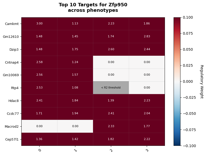
If you prefer we also have a heatmap option to plot TF-specific networks

fig, df = viz.plot_tf_network_heatmap("Zfp950",
                            top_n_targets = 10,
                            r2_threshold= 0.7,
                            labels= [0,1],
                            cmap = 'RdBu_r',
                            save =False,
                            mute = True)

======================================================================
PLOTTING TF NETWORK HEATMAP
======================================================================

Processing Zfp950...
Retrieving network for TF: Zfp950
Filtered out 696 targets. 304 targets remain.
  - 485 targets removed due to zero weights across all labels.
  - 211 targets removed due r2 across all labels .
Total targets for Zfp950: 304

We can plot any TF and targets that we want but to prioritize we can use the dissimilarity score across all labels to sort out a list of interesting TFs.

# Get top TFs by dissimilarity score for visualization
MinMax_all = viz.calculate_dissimilarity(verbose=True)
top_tfs = MinMax_all.head(10).index.tolist()

======================================================================
CALCULATING DISSIMILARITY SCORES ACROSS LABELS
======================================================================


Calculating dissimilarity scores (all cells)...

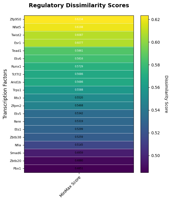
Top 10 TFs by MinMax dissimilarity score:
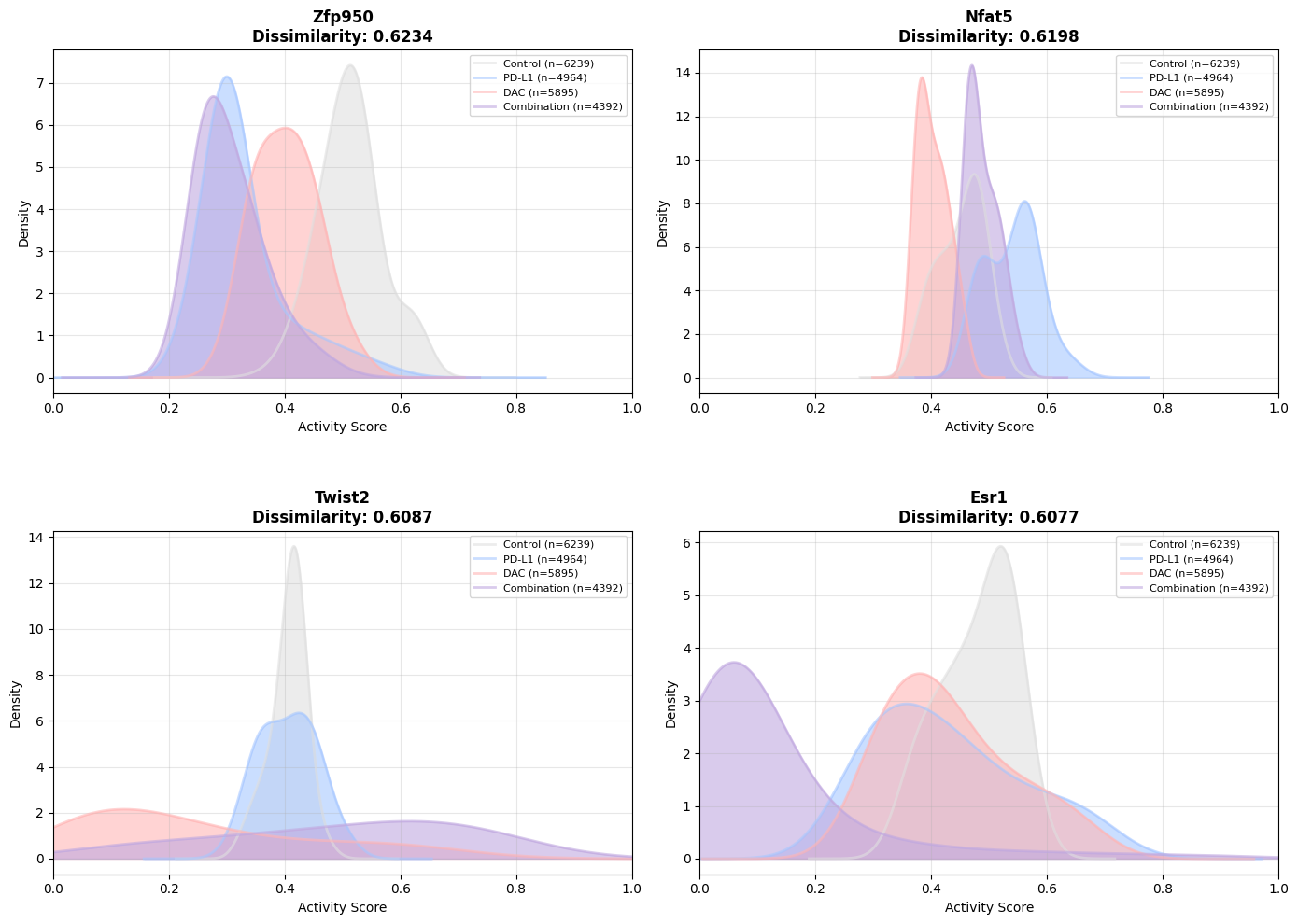
  Zfp950: 0.6234
  Nfat5: 0.6198
  Twist2: 0.6087
  Esr1: 0.6077
  Tead1: 0.5861
  Etv6: 0.5816
  Runx1: 0.5729
  Tcf7l2: 0.5686
  Arid1b: 0.5686
  Trps1: 0.5588

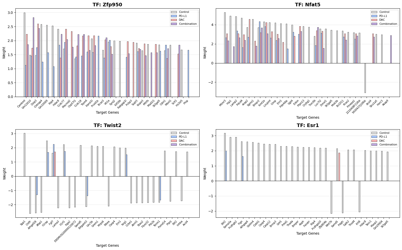
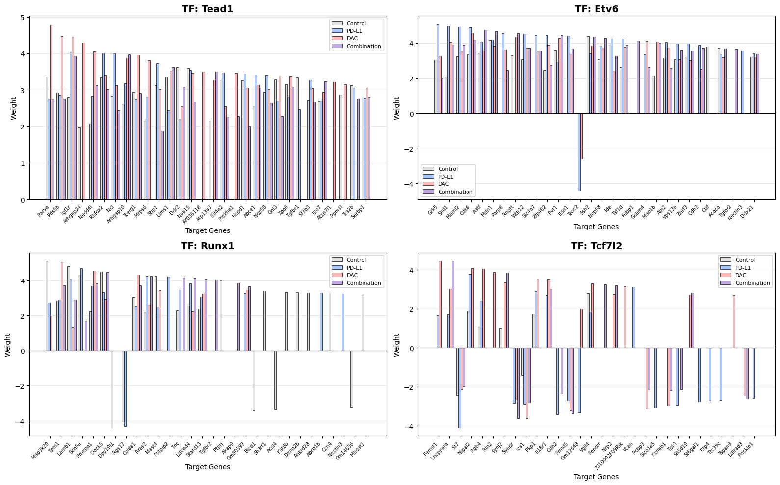
TF Weight Barplots

Visualize regulatory weights for transcription factors across target genes.

# Plot TF weights for top TFs
fig = viz.plot_tf_weights(
    tf_names = top_tfs,  # TFs to plot
    top_n_targets=30, # Number of top targets to display ordered by mean absolute weight
    r2_threshold = 0.7, # Only include targets with R² above this threshold
    grid_layout=(2,2),
    save = True,
    filename="Top_TF_weights_barplot.pdf"
)

======================================================================
PLOTTING TF WEIGHT BARPLOTS
======================================================================

Plotting 10 tfs...
Multi-page mode: 2x2 per page (3 pages)
  [1] Processing Zfp950...
  [1] Processing Nfat5...
  [1] Processing Twist2...
  [1] Processing Esr1...
Showing first 2 pages preview...

  [2] Processing Tead1...
  [2] Processing Etv6...
  [2] Processing Runx1...
  [2] Processing Tcf7l2...
Showing first 2 pages preview...

  [3] Processing Arid1b...
  [3] Processing Trps1...

✓ Saved 10 tfs to SimiCExampleRun/KPB25L/Tumor/outputSimic/figures/experiment_tumor/Top_TF_weights_barplot.pdf

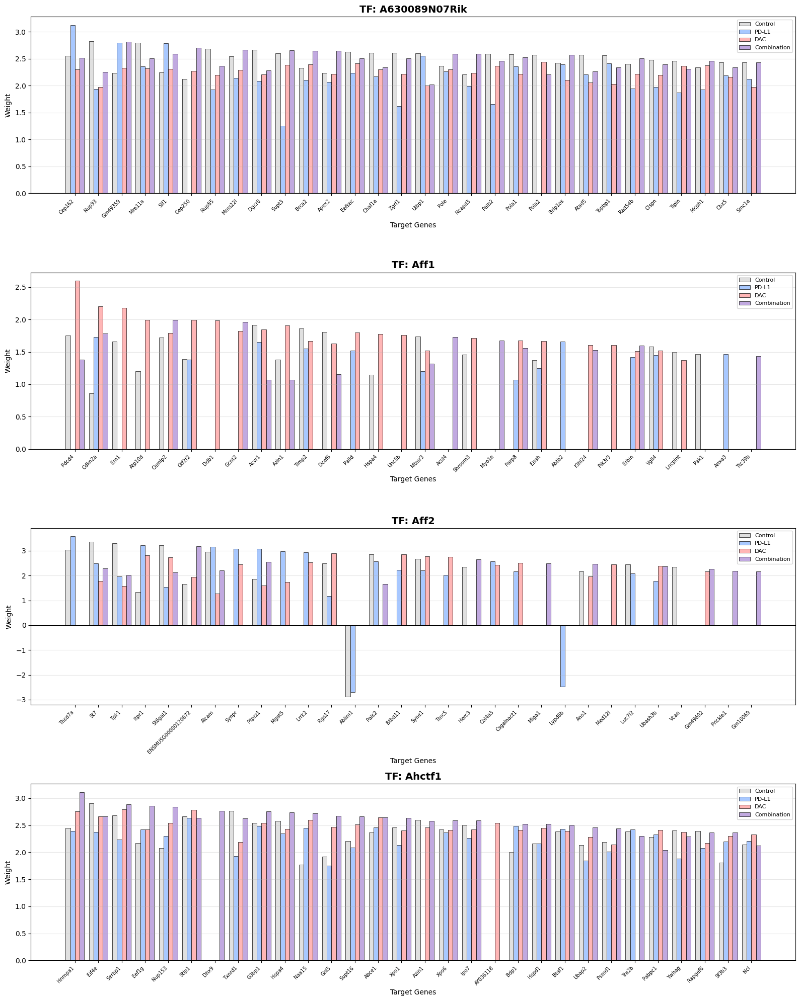
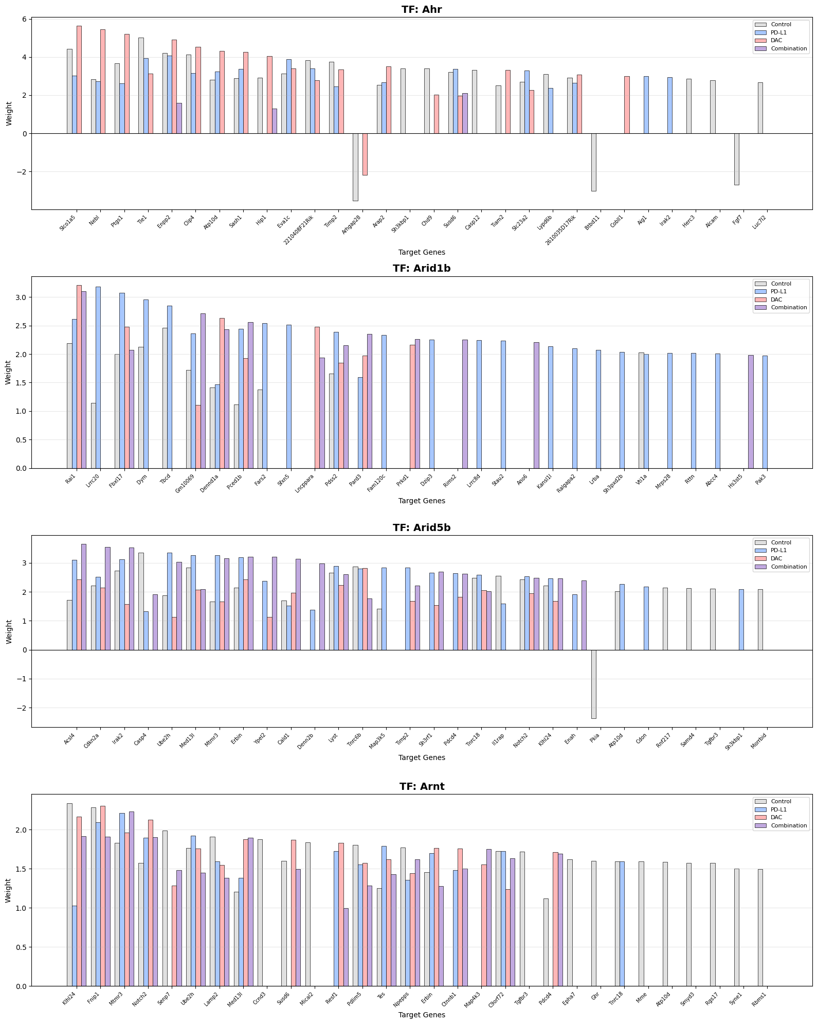
If you wish to generate barplots for all your TFs set tf_namesto None. TFs will be plotted in alphabetical order.

fig = viz.plot_tf_weights(
    tf_names = None, # Plot all TFs 
    top_n_targets=30,
    save=True,
    grid_layout = (4,1), # Define the grid layout (rows, columns) per pdf page
    r2_threshold = 0.7,
    filename="ALL_TF_weights_barplot_grid.pdf"
)

======================================================================
PLOTTING TF WEIGHT BARPLOTS
======================================================================

Plotting 100 tfs...
Multi-page mode: 4x1 per page (25 pages)
Generating all tf plots...
Showing first 2 pages preview...

Showing first 2 pages preview...


✓ Saved 100 tfs to SimiCExampleRun/KPB25L/Tumor/outputSimic/figures/experiment_tumor/ALL_TF_weights_barplot_grid.pdf

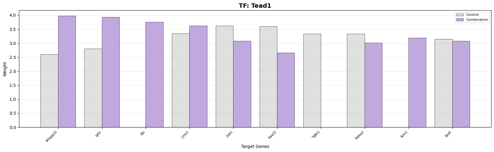
Note that you can also select the labels (phenotypes) to plot.

fig = viz.plot_tf_weights(
    tf_names="Tead1",  # TFs to plot
    labels = [0,3], # Specify which conditions to plot
    top_n_targets=10, # Number of top targets to display ordered by mean absolute weight
    grid_layout = None, # No grid layout, single plot
    r2_threshold = 0.7, # Only include targets with R² above this threshold
    save = False
)

======================================================================
PLOTTING TF WEIGHT BARPLOTS
======================================================================

Plotting 1 tfs...
Single page mode: 1 rows x 1 col
  [1] Processing Tead1...

Target Gene Weight Barplots

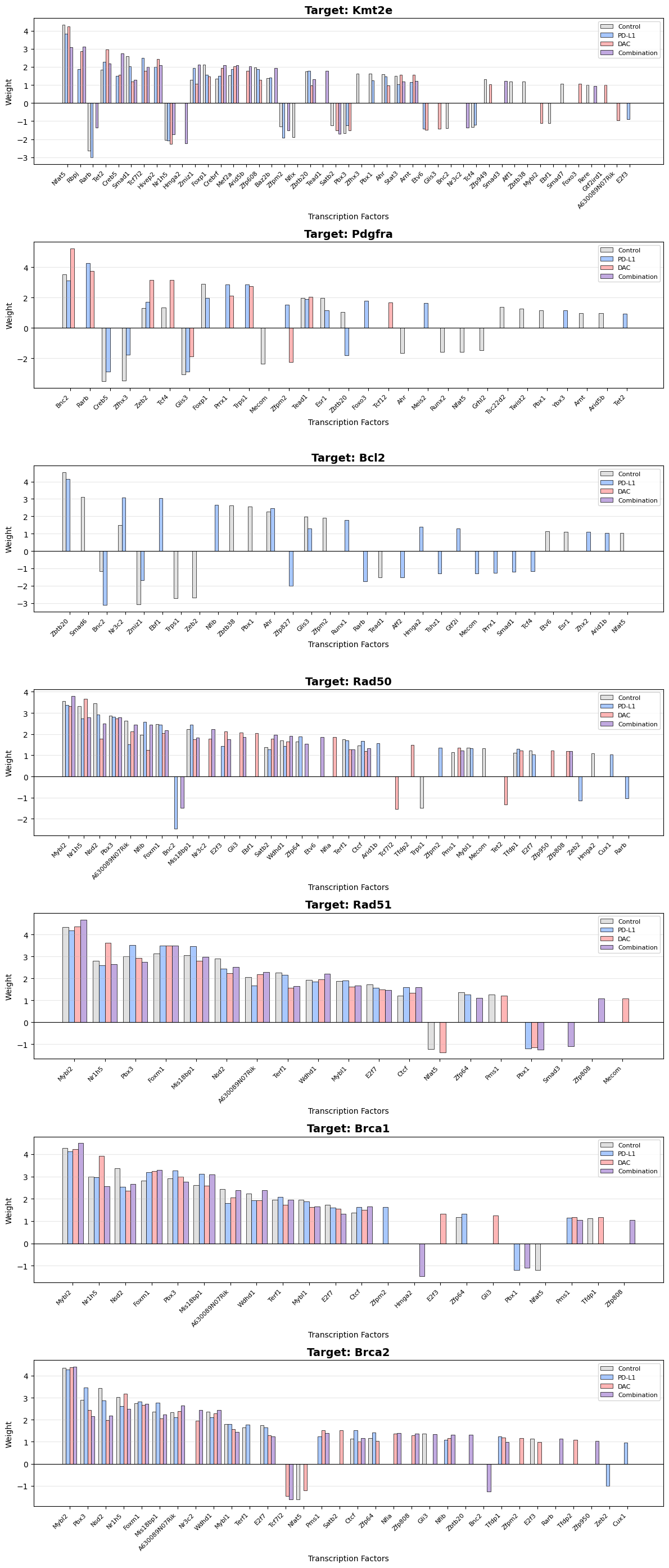
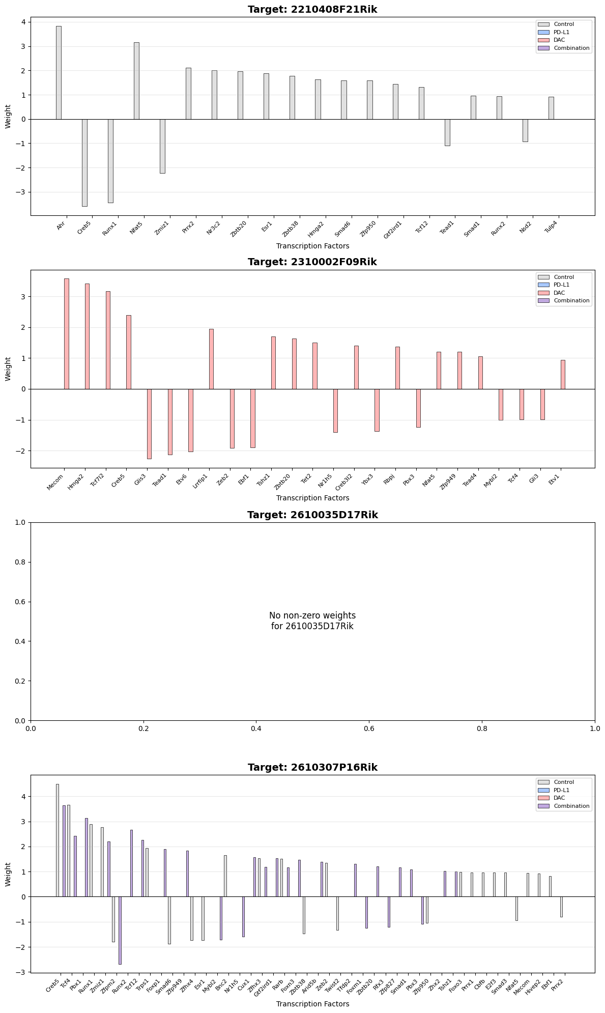
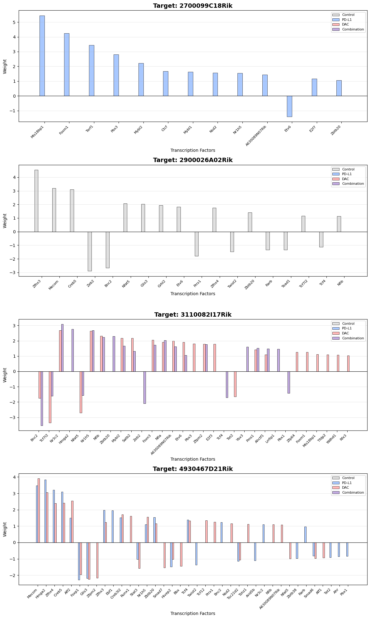
Visualize which TFs regulate specific target genes. In this case all the TFs that regulate the target will be displayed. Similar to plot_tf_weights you can customize the grid, layout, the labels and threshold.

# Example target genes - replace with genes of interest
target_genes = ['Kmt2e', 'Pdgfra', "Mdm2", 'Bcl2','Rad50','Rad51','Brca1','Brca2']

# Plot target weights
fig = viz.plot_target_weights(
    target_names=target_genes,
    labels = [0,1,2,3],
    r2_threshold = 0.7, # Will filter the targets if they are 
    grid_layout = None,
    save=True,
    filename="selected_target_weights_barplot.pdf"
)

======================================================================
PLOTTING TARGET WEIGHT BARPLOTS
======================================================================

Plotting 7 targets...
Single page mode: 7 rows x 1 col
  [1] Processing Kmt2e...
  [1] Processing Pdgfra...
  [1] Processing Bcl2...
  [1] Processing Rad50...
  [1] Processing Rad51...
  [1] Processing Brca1...
  [1] Processing Brca2...

✓ Saved 7 targets to SimiCExampleRun/KPB25L/Tumor/outputSimic/figures/experiment_tumor/selected_target_weights_barplot.pdf

Again, you can plot all the targets using:

fig = viz.plot_target_weights(
    target_names = None, # Plot all targets
    grid_layout = (4,1),
    save=True,
    r2_threshold = 0.9,
    filename="ALL_TARGET_weights_barplot_grid.pdf"
)

======================================================================
PLOTTING TARGET WEIGHT BARPLOTS
======================================================================

Plotting 1000 targets...
Multi-page mode: 4x1 per page (250 pages)
Generating all target plots...
Showing first 2 pages preview...

Showing first 2 pages preview...


✓ Saved 1000 targets to SimiCExampleRun/KPB25L/Tumor/outputSimic/figures/experiment_tumor/ALL_TARGET_weights_barplot_grid.pdf

Step 3: AUC Distribution Visualizations

Basic AUC Distributions

Plot TF activity score distributions with filled density curves.

# Plot AUC distributions for top TFs with filled density
fig = viz.plot_auc_distributions(
    tf_names=top_tfs[0:4],
    labels=[0, 1, 2, 3],
    grid_layout = None,
    fill=True,
    alpha=0.6,
    bw_adjust=0.5,
    save=True,
    filename="AUC_distributions_filled.pdf"
)
print("✓ Filled AUC distribution plots created")

======================================================================
PLOTTING AUC DISTRIBUTIONS
======================================================================

Comparing labels [0, 1, 2, 3].
Plotting 4 TFs...
Single page mode: 2 rows x 2 cols (all 4 TFs on one page)
  [1/4] Processing Zfp950...
  [2/4] Processing Nfat5...
  [3/4] Processing Twist2...
  [4/4] Processing Esr1...

✓ Saved 4 TFs to SimiCExampleRun/KPB25L/Tumor/outputSimic/figures/experiment_tumor/AUC_distributions_filled.pdf
Showing first 2 pages preview...

✓ Filled AUC distribution plots created

AUC Distribution Variations

Explore different visualization styles for detailed analysis.

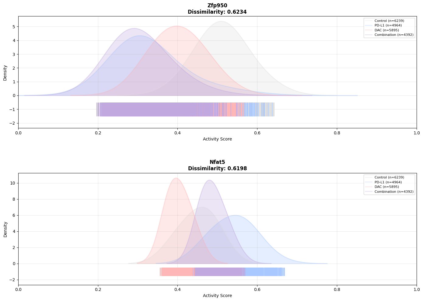
# Smooth, lightly filled density curves
viz.plot_auc_distributions(
    tf_names=top_tfs[0:2],
    labels=[0, 1, 2, 3],
    grid_layout=(2,1),
    fill=True,
    rug=True, # Add rug plot at bottom
    alpha=0.3,  # Less intense color
    bw_adjust=1.0,  # Smoother curves
    save=True,
    filename="AUC_distributions_smooth.pdf"
)

======================================================================
PLOTTING AUC DISTRIBUTIONS
======================================================================

Comparing labels [0, 1, 2, 3].
Plotting 2 TFs...
Multi-page mode: 2 rows x 1 cols per page (1 pages)
  [1/2] Processing Zfp950...
  [2/2] Processing Nfat5...


✓ Saved 2 TFs to SimiCExampleRun/KPB25L/Tumor/outputSimic/figures/experiment_tumor/AUC_distributions_smooth.pdf
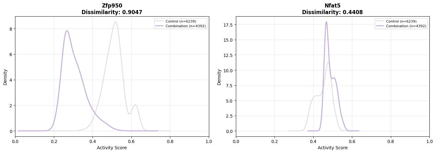
# Unfilled line plots showing fine details
viz.plot_auc_distributions(
    tf_names=top_tfs[0:2],
    labels=[0, 3], # Only 2 labels
    grid_layout=(1,2),
    fill=False,  # Line plot only
    bw_adjust=0.3,  # Less smooth - shows detail
    save=True,
    filename="AUC_distributions_detailed.pdf"
)

======================================================================
PLOTTING AUC DISTRIBUTIONS
======================================================================

Comparing labels [0, 3].
Plotting 2 TFs...
Multi-page mode: 1 rows x 2 cols per page (1 pages)
  [1/2] Processing Zfp950...
  [2/2] Processing Nfat5...


✓ Saved 2 TFs to SimiCExampleRun/KPB25L/Tumor/outputSimic/figures/experiment_tumor/AUC_distributions_detailed.pdf

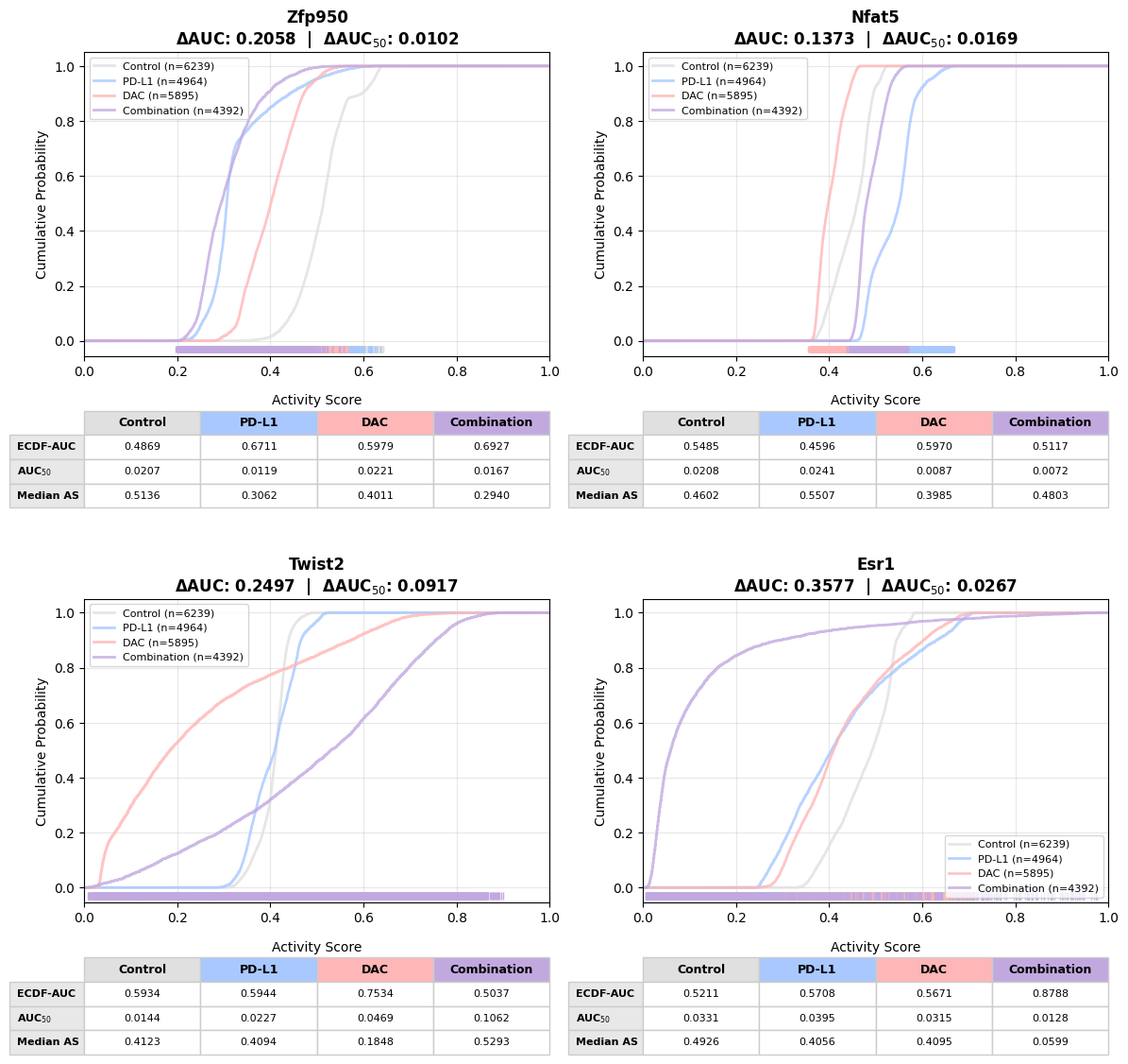
Cumulative Activity Scores distribution

Sorted by activity scores and calculates EDF AUC

viz.plot_auc_cumulative(
    tf_names=top_tfs[0:4],
    grid_layout=(2,2),
    rug = True, # No rug plot
    save=True,
    filename="AUC_cumulative.pdf"
)

======================================================================
PLOTTING AUC CUMULATIVE DISTRIBUTIONS
======================================================================

Comparing labels [0, 1, 2, 3].
Plotting 4 TFs...
Multi-page mode: 2 rows x 2 cols per page (1 pages)
  [1/4] Processing Zfp950...
  [2/4] Processing Nfat5...
  [3/4] Processing Twist2...
  [4/4] Processing Esr1...


✓ Saved 4 TFs to SimiCExampleRun/KPB25L/Tumor/outputSimic/figures/experiment_tumor/AUC_cumulative.pdf

You can extract the AUC metrics with the following function.

viz.calculate_ecdf_auc(top_tfs[0:4], percentile = 0.5)
Control_ecdf_auc Control_auc50 Control_x_at_p50 PD-L1_ecdf_auc PD-L1_auc50 PD-L1_x_at_p50 DAC_ecdf_auc DAC_auc50 DAC_x_at_p50 Combination_ecdf_auc Combination_auc50 Combination_x_at_p50 delta_ecdf_auc delta_auc50 delta_x_at_p50
TF
Zfp950 0.486935 0.020743 0.513637 0.671141 0.011903 0.306247 0.597880 0.022069 0.401069 0.692694 0.016730 0.294044 0.205759 0.010166 0.219593
Nfat5 0.548512 0.020755 0.460207 0.459647 0.024065 0.550666 0.596980 0.008749 0.398526 0.511656 0.007203 0.480327 0.137333 0.016862 0.152140
Twist2 0.593375 0.014428 0.412265 0.594367 0.022737 0.409429 0.753390 0.046872 0.184750 0.503674 0.106177 0.529341 0.249716 0.091749 0.344591
Esr1 0.521121 0.033058 0.492635 0.570840 0.039519 0.405646 0.567069 0.031456 0.409509 0.878789 0.012796 0.059880 0.357669 0.026723 0.432755

Step 4: Dissimilarity Heatmap

Visualize regulatory dissimilarity across all TFs.

# Plot dissimilarity heatmap for top TFs
fig = viz.plot_dissimilarity_heatmap(
    labels=[0, 1, 2, 3],
    top_n_tfs=20,
    save=True,
    filename="dissimilarity_heatmap.pdf"
)
print("✓ Dissimilarity heatmap created")

======================================================================
PLOTTING DISSIMILARITY HEATMAP
======================================================================

✓ Saved to SimiCExampleRun/KPB25L/Tumor/outputSimic/figures/experiment_tumor/dissimilarity_heatmap.pdf
✓ Dissimilarity heatmap created

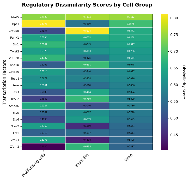
If you want to explore the regulatory dynamics accross phenotypes in different cell groups ( Cell types, subsets) you can add the metadata info to the function plot_dissimilarity_heatmap

import pandas as pd
import numpy as np

project_dir = "./SimiCExampleRun/KPB25L/Tumor"
auc_collected_file = "experiment_tumor_L1_0.01_L2_0.001_wAUC_matrices_filtered_BIC_collected.csv"
cell_ids = pd.read_csv(project_dir + "/outputSimic/matrices/experiment_tumor/" + auc_collected_file, index_col=0).index.to_list()
obs_meta = pd.read_csv("./data/metadata.tsv", sep = "\t", index_col=0)
obs_meta = obs_meta.loc[cell_ids] # Subset to cells in the project
obs_meta.head()
sample treatment cell_line final_annotation final_annotation_functional nn_majority_label nn_majority_frac flag_misplaced
cell
01_01_28__s1 KPB25L_control control KPB25L Cancer cells Proliferating cells Proliferating cells 1.0 False
01_01_62__s1 KPB25L_control control KPB25L Cancer cells Basal-like Basal-like 0.9 False
01_02_38__s1 KPB25L_control control KPB25L Cancer cells Basal-like Basal-like 1.0 False
01_02_54__s1 KPB25L_control control KPB25L Cancer cells Proliferating cells Proliferating cells 1.0 False
01_02_81__s1 KPB25L_control control KPB25L Cancer cells Basal-like Basal-like 1.0 False
# Generate a dictionary with the cell groupings based on the metadata column of interest
cell_groups = {}
grouping_column = 'final_annotation_functional'  
for group in obs_meta[grouping_column].unique():
    print(group)
    cell_groups[group] = obs_meta[obs_meta[grouping_column] == group].index.tolist()    
    
Proliferating cells
Basal-like
fig = viz.plot_dissimilarity_heatmap(
    labels=[0, 1, 2 , 3],
    cell_groups=cell_groups, # Add cell groupings to the heatmap
    top_n_tfs=20,
    sort_by = "mean_score", # Can be "mean_score" or any group in cell groups
    save=True,
    filename="dissimilarity_heatmap2.pdf"
)

======================================================================
PLOTTING DISSIMILARITY HEATMAP
======================================================================

✓ Saved to SimiCExampleRun/KPB25L/Tumor/outputSimic/figures/experiment_tumor/dissimilarity_heatmap2.pdf

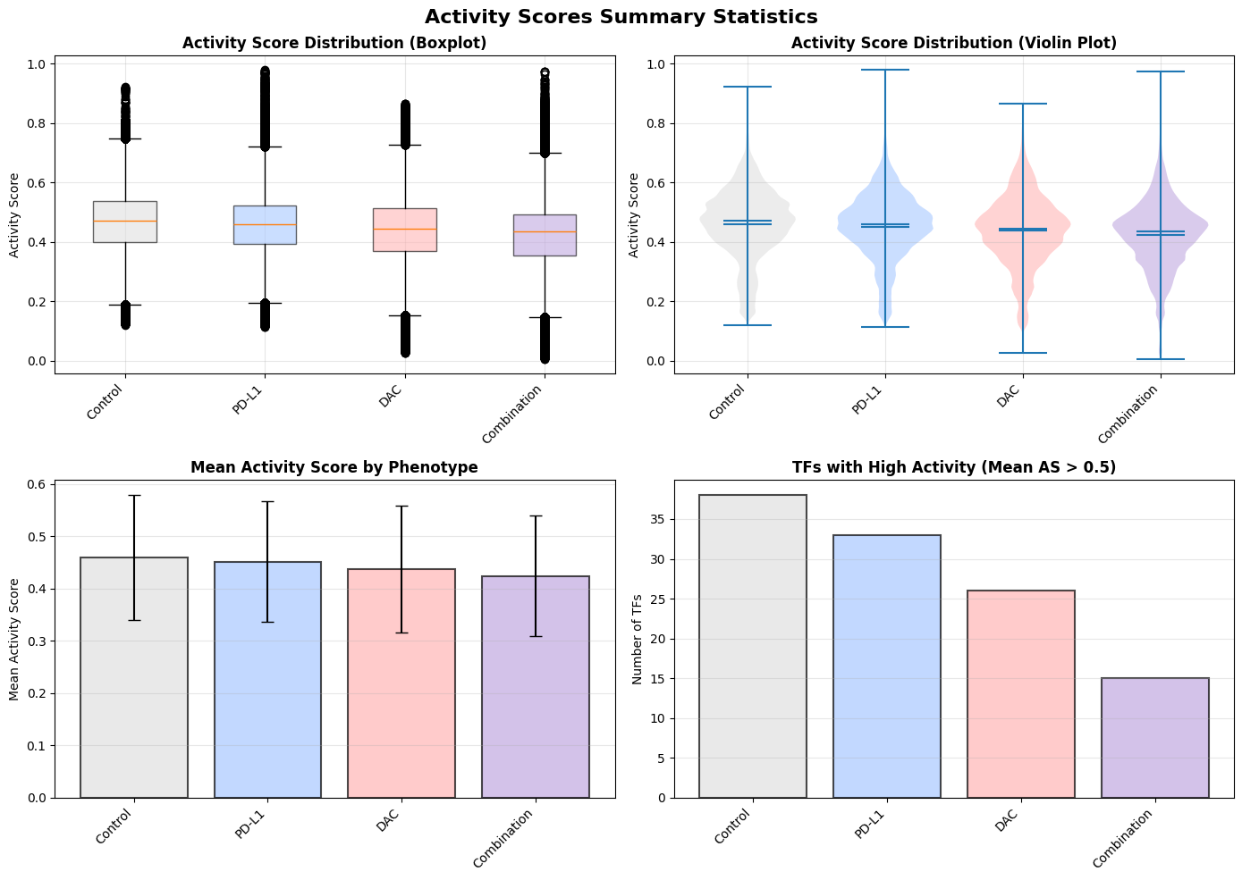
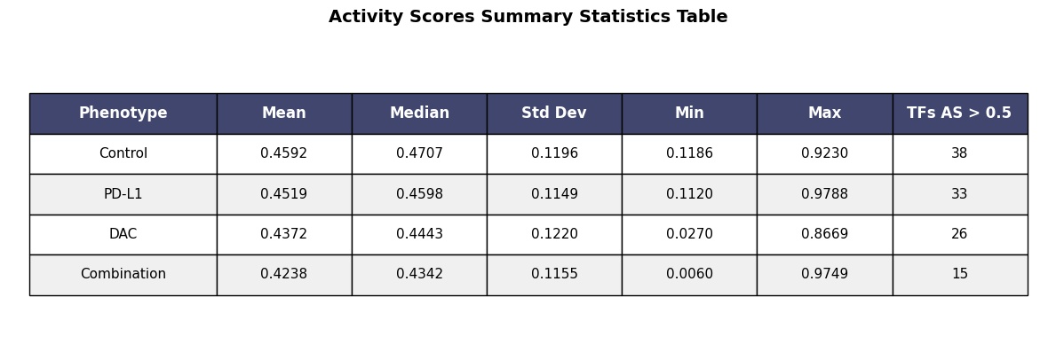
Step 5: Summary Statistics Visualization

Create a comprehensive overview of AUC score distributions.

viz.plot_auc_summary_statistics(labels=[0, 1, 2, 3], save=True)

======================================================================
PLOTTING AUC SUMMARY STATISTICS
======================================================================

Label Control: 623900 AUC values
Label PD-L1: 496400 AUC values
Label DAC: 589500 AUC values
Label Combination: 430416 AUC values
✓ Saved to SimiCExampleRun/KPB25L/Tumor/outputSimic/figures/experiment_tumor/experiment_tumor_AUC_summary_statistics.pdf

viz.plot_auc_statistics_table(save=True)

======================================================================
PLOTTING AUC STATISTICS TABLE
======================================================================

Label Control: 623900 AUC values
Label PD-L1: 496400 AUC values
Label DAC: 589500 AUC values
Label Combination: 430416 AUC values
✓ Saved to SimiCExampleRun/KPB25L/Tumor/outputSimic/figures/experiment_tumor/experiment_tumor_AUC_statistics_table.pdf

Step 6: UMAP Integration (Optional)

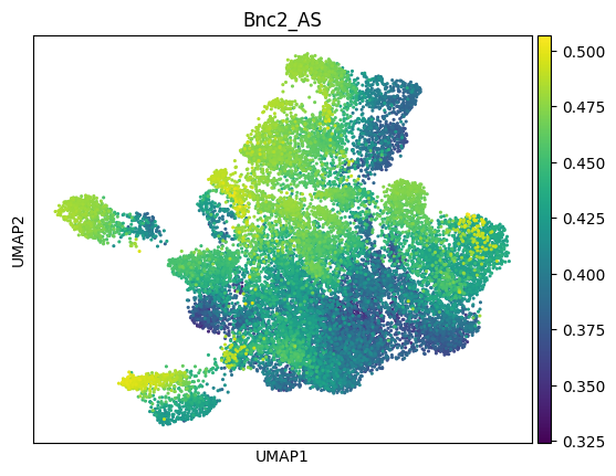
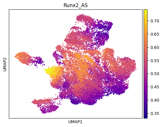
If you have an AnnData object with UMAP coordinates, you can visualize single cell TF activity on the embeddings using the viz.get_TF_auc() to extract selected TF activity scores in a pd.DataFrame format (see example below).

Alternatively, if you are more confortable with Seurat/SingleCellExperiment (R world) you can easily incorporate these activity scores in the metadata.

A complete matrix for all TFs was automatically saved in when you run SimiCPipeline.

    matrices/
        └── experiment_tumor/
            └── experiment_tumor_L1_0.01_L2_0.001_wAUC_matrices_filtered_BIC_collected.csv
import scanpy as sc
import pandas as pd
import simicpipeline
# Load your AnnData object
adata = simicpipeline.load_from_anndata('./data/DAC_aPDL1_seurat_annotated.h5ad')
adata_subset = adata.copy()
adata_subset = adata_subset[adata_subset.obs["final_annotation_functional"].isin(['Proliferating cells','Basal-like'])].copy()
adata_subset = adata_subset[adata_subset.obs["cellLine"] == "KPB25L"].copy()
print(adata_subset)

# Step 1. Extract auc scores for specific TFs
tf_names = ["Bnc2", "Runx2"]
activity_scores = viz.get_TF_auc(TF_name= tf_names, stacked=True)
col_names = [tf + "_AS" for tf in tf_names]
non_tf_cols = activity_scores.columns.difference(tf_names) 
col_names.extend(list(non_tf_cols))
activity_scores.columns = col_names
# print(activity_scores.head())

# Step 2: Check if all indices in activity_scores are in adata.obs
missing_indices = activity_scores.index.difference(adata.obs.index)

if len(missing_indices) > 0:
    print(f"Warning: {len(missing_indices)} indices in activity_scores are NOT in adata.obs")
    print("Missing indices:", missing_indices.tolist())
else:
    print("✓ All indices in activity_scores are found in adata.obs")
    
# Step 3: Add activity scores to AnnData object metadata
# Ensure the indices of `activity_scores` match the `adata.obs` index
adata_subset.obs = adata_subset.obs.join(activity_scores)
adata_subset.obs
AnnData object with n_obs × n_vars = 21490 × 36774
    obs: 'orig.ident', 'nCount_RNA', 'nFeature_RNA', 'sample', 'species', 'gene_count', 'tscp_count', 'mread_count', 'bc1_wind', 'bc2_wind', 'bc3_wind', 'bc1_well', 'bc2_well', 'bc3_well', 'treatment', 'cellLine', 'percent.mt', 'percent.rb', 'percent.hb', 'integrated_snn_res.0.095', 'seurat_clusters', 'sctype_custom', 'sctype_functional', 'sctype_SCsubtype', 'final_annotation', 'final_annotation_functional'
    var: 'vf_vst_counts.1_mean', 'vf_vst_counts.1_variance', 'vf_vst_counts.1_variance.expected', 'vf_vst_counts.1_variance.standardized', 'vf_vst_counts.1_variable', 'vf_vst_counts.1_rank', 'vf_vst_counts.2_mean', 'vf_vst_counts.2_variance', 'vf_vst_counts.2_variance.expected', 'vf_vst_counts.2_variance.standardized', 'vf_vst_counts.2_variable', 'vf_vst_counts.2_rank', 'vf_vst_counts.3_mean', 'vf_vst_counts.3_variance', 'vf_vst_counts.3_variance.expected', 'vf_vst_counts.3_variance.standardized', 'vf_vst_counts.3_variable', 'vf_vst_counts.3_rank', 'vf_vst_counts.4_mean', 'vf_vst_counts.4_variance', 'vf_vst_counts.4_variance.expected', 'vf_vst_counts.4_variance.standardized', 'vf_vst_counts.4_variable', 'vf_vst_counts.4_rank', 'vf_vst_counts.5_mean', 'vf_vst_counts.5_variance', 'vf_vst_counts.5_variance.expected', 'vf_vst_counts.5_variance.standardized', 'vf_vst_counts.5_variable', 'vf_vst_counts.5_rank', 'vf_vst_counts.6_mean', 'vf_vst_counts.6_variance', 'vf_vst_counts.6_variance.expected', 'vf_vst_counts.6_variance.standardized', 'vf_vst_counts.6_variable', 'vf_vst_counts.6_rank', 'vf_vst_counts.7_mean', 'vf_vst_counts.7_variance', 'vf_vst_counts.7_variance.expected', 'vf_vst_counts.7_variance.standardized', 'vf_vst_counts.7_variable', 'vf_vst_counts.7_rank', 'vf_vst_counts.8_mean', 'vf_vst_counts.8_variance', 'vf_vst_counts.8_variance.expected', 'vf_vst_counts.8_variance.standardized', 'vf_vst_counts.8_variable', 'vf_vst_counts.8_rank', 'vf_vst_counts_mean', 'vf_vst_counts_variance', 'vf_vst_counts_variance.expected', 'vf_vst_counts_variance.standardized', 'vf_vst_counts_variable', 'vf_vst_counts_rank', 'var.features', 'var.features.rank'
Retrieving AUC for TF: ['Bnc2', 'Runx2']
✓ All indices in activity_scores are found in adata.obs
orig.ident nCount_RNA nFeature_RNA sample species gene_count tscp_count mread_count bc1_wind bc2_wind ... seurat_clusters sctype_custom sctype_functional sctype_SCsubtype final_annotation final_annotation_functional Bnc2_AS Runx2_AS category label
19_02_08__s1 snParseBS 3862.0 1768 KPB25L_Combination GRCm39 1768 3862 5716 19 2 ... 0 Cancer cells Proliferating cells Proliferating cells Cancer cells Proliferating cells 0.377879 0.423201 3 Combination
19_02_88__s1 snParseBS 17490.0 4358 KPB25L_Combination GRCm39 4358 17490 26167 19 2 ... 0 Unknown Basal-like Basal-like Cancer cells Basal-like 0.404524 0.562691 3 Combination
19_03_02__s1 snParseBS 11969.0 4256 KPB25L_Combination GRCm39 4256 11969 17970 19 3 ... 0 Cancer cells Proliferating cells Proliferating cells Cancer cells Proliferating cells 0.394006 0.418656 3 Combination
19_03_23__s1 snParseBS 12740.0 4344 KPB25L_Combination GRCm39 4344 12740 19284 19 3 ... 0 Cancer cells Proliferating cells Proliferating cells Cancer cells Proliferating cells 0.397667 0.388375 3 Combination
19_03_58__s1 snParseBS 9432.0 3769 KPB25L_Combination GRCm39 3769 9432 13858 19 3 ... 0 Cancer cells Proliferating cells Proliferating cells Cancer cells Proliferating cells 0.349208 0.470325 3 Combination
... ... ... ... ... ... ... ... ... ... ... ... ... ... ... ... ... ... ... ... ... ...
06_91_33__s8 snParseBS 13276.0 4469 KPB25L_control GRCm39 4469 13276 19719 6 91 ... 0 Cancer cells Proliferating cells Proliferating cells Cancer cells Proliferating cells 0.408736 0.487791 0 control
06_92_32__s8 snParseBS 1971.0 1418 KPB25L_control GRCm39 1418 1971 3035 6 92 ... 0 Unknown Basal-like Basal-like Cancer cells Basal-like 0.484079 0.359527 0 control
06_92_74__s8 snParseBS 10972.0 3699 KPB25L_control GRCm39 3699 10972 16333 6 92 ... 0 Cancer cells Proliferating cells Proliferating cells Cancer cells Proliferating cells 0.411149 0.457182 0 control
06_92_89__s8 snParseBS 6205.0 2592 KPB25L_control GRCm39 2592 6205 9053 6 92 ... 0 Unknown Basal-like Basal-like Cancer cells Basal-like 0.471215 0.590060 0 control
06_96_82__s8 snParseBS 9325.0 3496 KPB25L_control GRCm39 3496 9325 13980 6 96 ... 0 Unknown Basal-like Basal-like Cancer cells Basal-like 0.469899 0.530313 0 control

21490 rows × 30 columns

Run these steps from the scanpy tutorial or use your processed object.

# Normalizing to median total counts
sc.pp.normalize_total(adata_subset)
# Logarithmize the data
sc.pp.log1p(adata_subset)
sc.pp.highly_variable_genes(adata_subset, n_top_genes=2000, batch_key="sample")
sc.tl.pca(adata_subset)
sc.pp.neighbors(adata_subset, use_rep='X_pca', n_neighbors=15)
sc.tl.umap(adata_subset)
# Plot UMAP for Bnc2 activity scores
sc.pl.umap(adata_subset, color="Bnc2_AS", cmap="viridis", size=20)
# Plot UMAP for Runx2 activity scores
sc.pl.umap(adata_subset, color="Runx2_AS", cmap="plasma", size=20)

Step 8: Export Results

You can easily save all the visualizations generated with the argument save= True and customize the name with filename. Furthermore, all plotting functions return a matplotlib.pyplot figure so you can manually save it.

Additional functionalities

Customize Label Names

You can access and change the labels and colors after initialization with the function set_label_names()

# Set custom label names for better visualization
viz.set_label_names(
    p2assignment=viz.project_dir / "inputFiles/treatment_annotation.csv",
    label_names={0: 'Control', 1: 'PD-L1',2: 'DAC',3: 'Combination'},
    colors={0: '#e0e0e0', 1: '#a8c8ff', 2: '#ffb6b6', 3: '#c1a9e0'})

print(f"✓ Label names configured: {viz.label_names}")
print(f"✓ Colors configured: {viz.colors}")
Label names set: {0: 'Control', 1: 'PD-L1', 2: 'DAC', 3: 'Combination'}
Label colors set: {0: '#e0e0e0', 1: '#a8c8ff', 2: '#ffb6b6', 3: '#c1a9e0'}
✓ Label names configured: {0: 'Control', 1: 'PD-L1', 2: 'DAC', 3: 'Combination'}
✓ Colors configured: {0: '#e0e0e0', 1: '#a8c8ff', 2: '#ffb6b6', 3: '#c1a9e0'}

Set Up File Paths

Point the visualization to your pipeline results files. This is useful if you have old SImiC runs and want to take advantage of the visualization funcitonality.

viz2 = SimiCVisualization(
    project_dir="./SimiCExampleRun/KPB25L/Tumor",
    run_name="experiment_tumor",
    search = False,
    lambda1=0.1,
    lambda2=0.01,
    p2assignment="./SimiCExampleRun/KPB25L/Tumor/inputFiles/treatment_annotation.cav",
    label_names={0: 'Control', 1: 'PD-L1',2: 'DAC',3: 'Combination'},
    colors={0: '#e0e0e0', 1: '#a8c8ff', 2: '#ffb6b6', 3: '#c1a9e0'}
)

out_dir = viz2.project_dir / "outputSimic/matrices/" / viz2.run_name

# If you're continuing from a previous run, set the paths
viz2.set_paths_custom(
    force = True,
    p2df=viz2.project_dir / "inputFiles/expression_matrix.pickle",
    p2assignment=viz2.project_dir / "inputFiles/treatment_annotation.cav",
    p2tf=viz2.project_dir / "inputFiles/TF_list.csv",
    p2simic_matrices= out_dir / "experiment_tumor_L1_0.1_L2_0.01_simic_matrices.pickle",
    p2filtered_matrices = out_dir / "experiment_tumor_L1_0.1_L2_0.01_simic_matrices_filtered_BIC.pickle",
    p2auc_raw= out_dir / "experiment_tumor_L1_0.1_L2_0.01_wAUC_matrices.pickle",
    p2auc_filtered= out_dir / "experiment_tumor_L1_0.1_L2_0.01_wAUC_matrices_filtered_BIC.pickle"
)
Warning: Figures path already exists. Existing figures may be overwritten.
Warning: No data found to determine labels.

======================================================================
SETTING CUSTOM PATHS
======================================================================

✓ Custom paths successfully set.

======================================================================
viz2.available_results()

Available Results:
✗ Ws_raw
✗ Ws_filtered
✗ auc_raw
✗ auc_filtered

======================================================================

Summary

This tutorial covered:

✓ Creating visualization objects from SimiCPipeline results

✓ Customizing label names for clarity and colors

✓ Weight distribution visualizations (R², TF weights, target weights)

✓ TF-specific network visualization

✓ AUC score distributions with multiple visualization styles

✓ Dissimilarity analysis across phenotypes and cell types

✓ Summary statistics and comprehensive overviews

✓ Optional UMAP visualization

Generate a printed summary of all created visualizations.

# List all generated figures
figure_files = sorted(viz.figures_path.glob('*.pdf'))

print("\n" + "="*70)
print("VISUALIZATION SUMMARY")
print("="*70)
print(f"\nGenerated {len(figure_files)} visualization files:")
print(f"\nSaved to: {viz.figures_path}\n")

for i, fig_file in enumerate(figure_files, 1):
    print(f"{i}. {fig_file.name}")

print("\n" + "="*70)

======================================================================
VISUALIZATION SUMMARY
======================================================================

Generated 13 visualization files:

Saved to: SimiCExampleRun/KPB25L/Tumor/outputSimic/figures/experiment_tumor

1. ALL_TARGET_weights_barplot_grid.pdf
2. ALL_TF_weights_barplot_grid.pdf
3. AUC_cumulative.pdf
4. AUC_distributions_detailed.pdf
5. AUC_distributions_filled.pdf
6. AUC_distributions_smooth.pdf
7. R2_distribution.pdf
8. Top_TF_weights_barplot.pdf
9. dissimilarity_heatmap.pdf
10. experiment_tumor_AUC_statistics_table.pdf
11. experiment_tumor_AUC_summary_statistics.pdf
12. experiment_tumor_network_Bnc2_heatmap.pdf
13. selected_target_weights_barplot.pdf

======================================================================

Next Steps

  1. Customize visualizations: Modify colors, styles, and layouts to match your publication requirements
  2. Export figures: Save high-resolution PDFs suitable for manuscript submission with different layouts
  3. Deep-dive analysis: Use pipeline methods to extract data for custom visualizations
  4. Network analysis: Combine results with network analysis tools for interactive exploration
  5. Biological validation: Cross-reference predicted regulons with experimental data

Additional Resources

  • Data preprocessing: Tutorial_SimiCPipeline_preprocessing.ipynb
  • Complete pipeline tutorial: Tutorial_SimiCPipeline_full.ipynb
  • API documentation: Check the SimiCPipeline and SimiCVisualization class docstrings
  • Original publication: Peng et al., Commun Biol 5, 351 (2022)